Label Design is Key to Product Design and Branding
Would Custom Illustration be a good fit for your brand?
Label design is often essential to product packaging but with flashy new products popping up left and right how do you make your products stand out? A great solution is illustration. Using illustration on your labels can be an investment but it is an incredibly useful tool when you need your product and brand to stand up against fierce competition. By entertaining the eye and even plucking at consumer nostalgia illustration can be an effective strategy for your product labels. We’ve selected some extremely creative examples to show just how illustration can be to your label design when you need to capture your consumer’s attention.
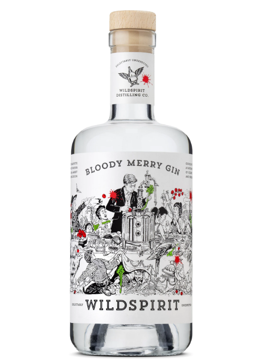
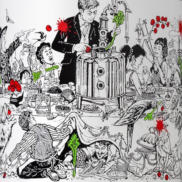
This gin label was designed to show the chaotic and wild nature of the brand and the product. The detailed illustration is styled like a vintage etching that works extremely well on the thick, textured, paper. Liquor and wine labels often have stiff competition in stores because product distribution is often limited to retail. Therefore, every label will be judged directly against its competitors. This label successfully draws the eye and, because of its detailed design, maintains the customer’s attention for a long period, thus increasing the likelihood of making a sale.
Illustration on labels is a great way to hold a consumer’s attention for longer. By adding story and detail (and tomato spatters in this example) the consumer wants to keep looking to see more. This label also manages to entertain consumers with its comedic theme. Being entertaining is impressive enough for a label but this design will surely make consumers want to buy the product again.
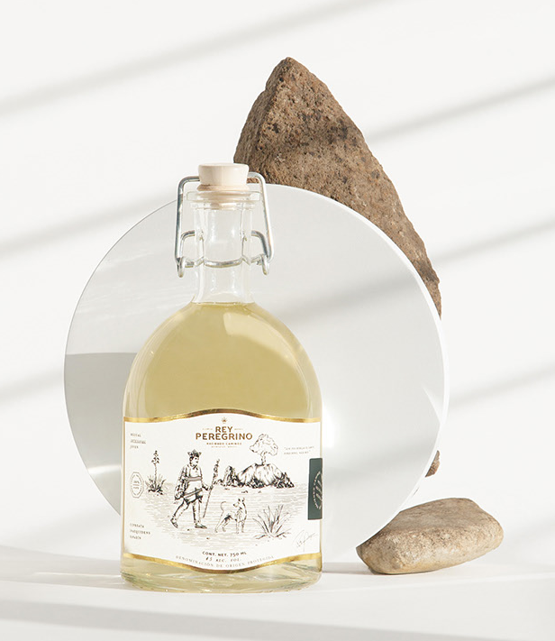
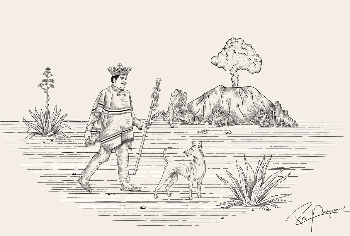
The label for this bottle of mezcal has a similar style as the gin, with the etching on thick, textured, paper label but it shows a much different brand. Whereas the gin label is chaotic, this label was illustrated to reflect a high-quality product and the region it is from. The illustration itself shows the area of Mexico where the mezcal is made and the characters represent a journey. However, the frame of the label is what gives the entire bottle a more refined look. The gold finish around the edge and the small emerald green label make this product feel even more special and compliment the illustration. Another important note is that the earthy tones of the label and gold frame compliment the color of the product itself. This thoughtful design gives the entire product a polished look.
If you know your packaging is going to show the product itself its a good choice to show colors and style that are cohesive with the product. This mezcal is a delicate, transparent gold so the designers purposely used a color palette and illustration that felt soft and warm.
Illustrations May Work Great for Organic & Natural Product Packaging or Label Design
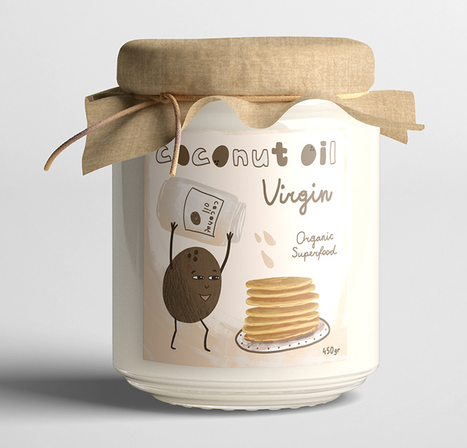
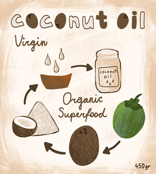
This label design has gone in a completely different direction from the first 2 examples. The packaging design of the coconut oil jar needed to reflect the nature of the brand; warm, friendly, and pleasant. So the illustration style chosen is childlike with warm earthy tones. The design of this label is intentionally imperfect. While other brands might want to show off the superiority of their product this brand’s goal is to give consumers a good feeling when they see the label. Its playing to consumers’ more fun and childlike side.
This is one of the useful things about illustration. Using just a label you can show the character of your brand and connect with consumers on a deeper level. This label may remind consumers of the cartoony cereal boxes they read when they were kids and therefore makes them feel comforted and entertained when they look at it.
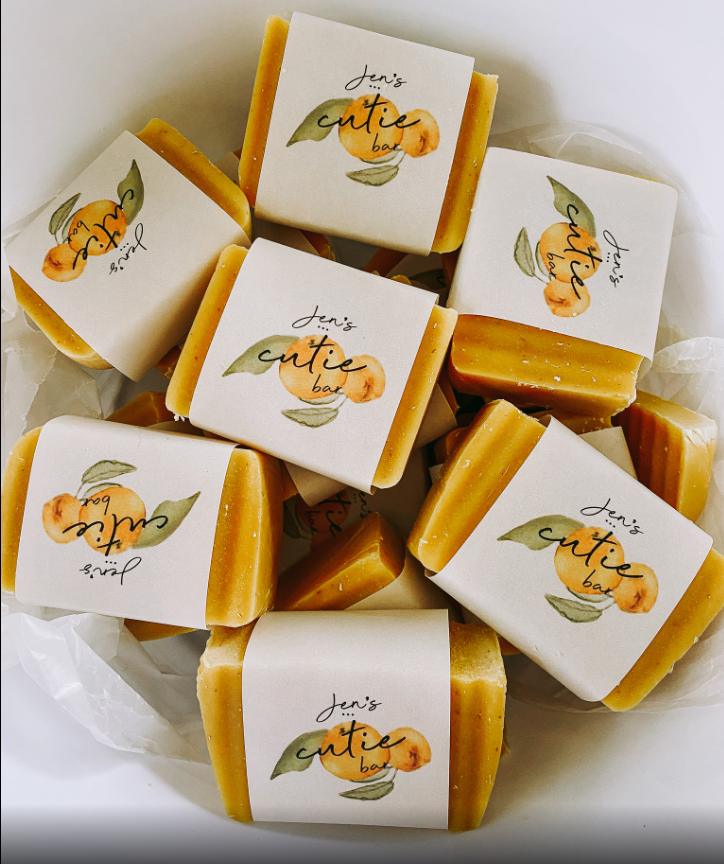
Sleeves are an excellent way to go when deciding the kind of label your product needs. They’re cheaper, better for the environment, and show off the product itself by not covering it entirely.
This soap label is a great example of what illustration can do for a sleeve label.
By using a beautiful watercolor the label enhances the look of the products itself with its complementary colors. The combination of the illustration and product color gives off a feeling of summer and comfort. The simple design of the handwritten font over the illustration also makes the product feel natural. This label would not feel out of place in a natural body care store or boutique.
This example shows just how much can be done when you use great illustration and design on an inexpensive label. By investing in thoughtful artwork and graphic design this soap brand has a beautiful design that can make a cheap sleeve look elegant.
BRANDING IS WHAT WE DO™ is Denver, Colorado’s best choice for your graphic design, packaging design and branding needs. We are located in Denver’s business district Downtown on 16th street and Larimer. Please contact us today for more information about how we can help your brand and marketing efforts.


