
Catalog design is an important tool to show off your products and services. Even if your catalog is not in print it’s still an important feature to your website. Using minimal design style is an effective way to create a catalog layout that looks modern and attractive.
Before you start designing it’s important to outline what text and images need to be included in your catalog. Establishing this beforehand will make the layout design process much smoother and it will help you establish what tone you’d like the catalog to have.
Don’t be afraid of “White Space” for a clean and modern looking catalog design
- White space is an important element to minimal design. It gives the layout a feeling of calm and simplicity. It will also draw the viewer’s eye to focus on the image and text of your catalog.
- White space is also an opportunity to minimize your text to the most important message. Brainstorm what is the simplest and most effective way to communicate what you’ve written and then add it to the catalog design.
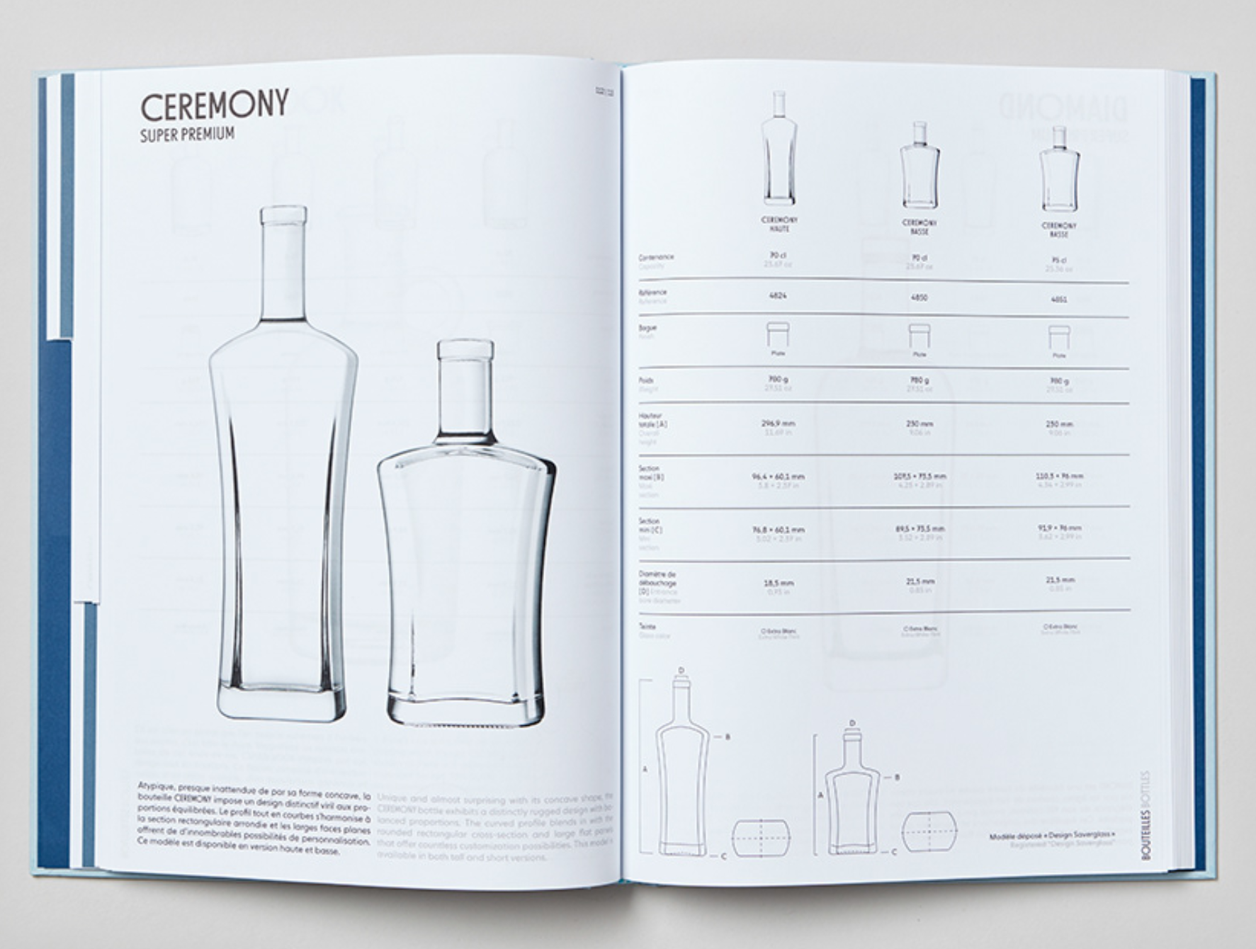
Add balancing elements to your catalog design
When minimizing what you’re putting on the page, balance is important for your graphic design, images, and text.
In this example the catalog layout balances the two images and font and creates a flow between the two pages.

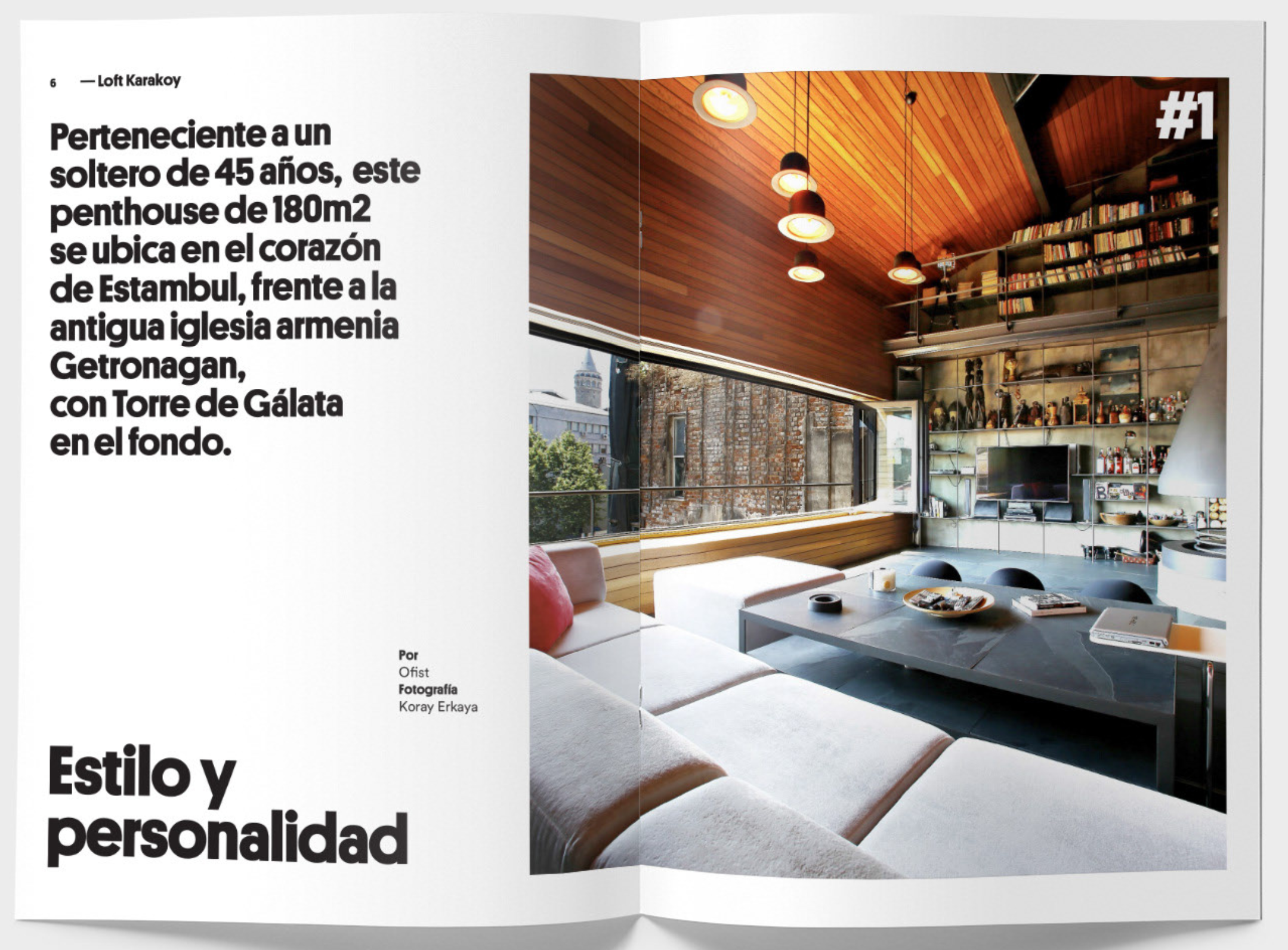
Consider your catalog design fonts carefully
- Create a font palette for your Catalog, don’t include more than 2 different fonts and establish the purpose of each of these fonts.
- In this example the designer used 1 font but in 2 different weights with different sizes. Each size and weight has a purpose: A Call Out, an Image Caption, etc..
- Using fonts is a great way to organize the information you need to put in your catalog without sacrificing good design. Creating a font palette will establish a visual system for your text and makes it simpler for the reader to digest.
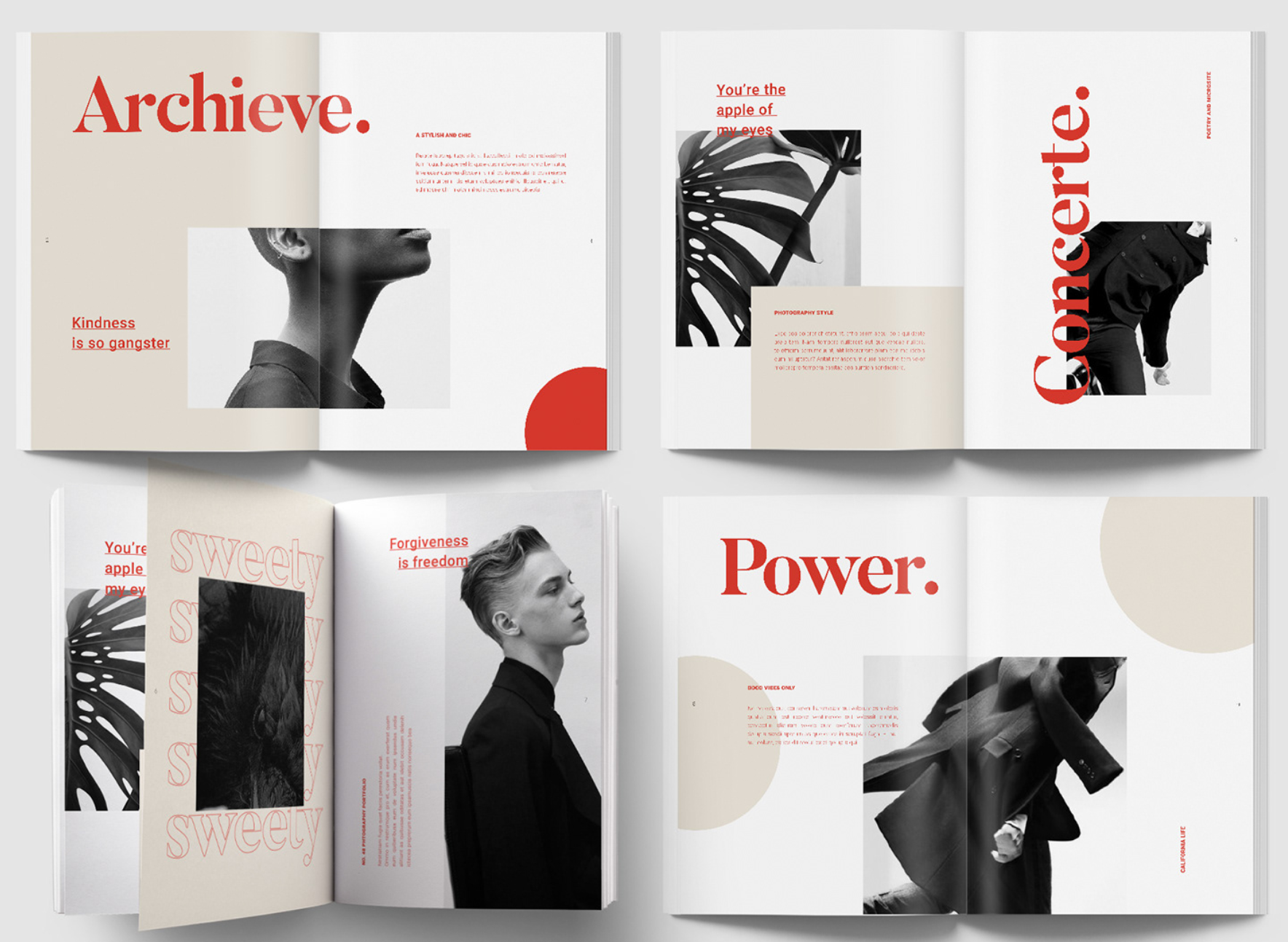
Create your catalog design color pallet and stick to it for a cohesive look
- If you’re using minimal color use 1 accent color to draw the eye to key images and messages in the catalog design.
- This catalog design uses a rich crimson accent to draw the eye around the page layout. It draws the eye first to the Title, then the Subtitle, then the Copy. The result is an attractive way to draw the reader in to read the smaller text in the catalog.
BRANDING IS WHAT WE DO™ is a Denver, Colorado based graphic design firm with a focus on brand identity and commercial printing services. To get a quote for your next branding or printing service, please call us today at 303-396-0292.


