A Unique Style of Logo Design That May Work Great for Your Brand
When creating a new logo design it’s usually necessary to consider what’s modern, but there are some brands that need their logo to look both modern and old.
Combining the past and the present isn’t uncommon with branding and logo design. For example, Ben and Jerry’s purposefully uses a modern/retro brand identity to show off it brand fun vibe and and social activism. The company was started in the 70’s in a city known for its “hippy” culture so keeping that style references their past and making it look modern keeps the brand relevant to new generations. However the they are referencing a fairly recent era, what happens if you need to make a logo that looks modern and 140 years old?
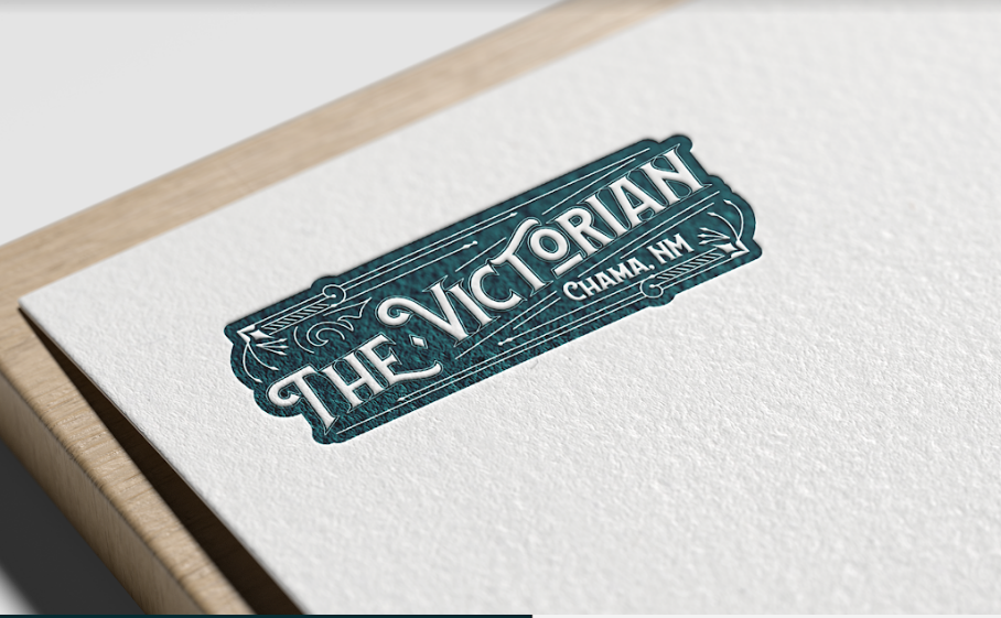
BRANDING IS WHAT WE DO recently approached this challenge when we needed to create a logo design for a high end Bed & Breakfast inside a Victorian house.
We took inspiration from the maximalist design of the Victorian Era and created a frame for the logo that would feel luxurious. Because logos and signs in the 1880’s tended to have thinner fonts and an excess of curlicues we needed to consider what would be easier for a modern crowd to read. We decided to add a thick font for the logo (a current design trend) and replace the curlicues with small curves and details on the letters of the logo.

Trying to balance vintage and modern in a logo is difficult for any brand but it can be the best way to highlight the nature of your business. Some of the best examples of these logos can be seen in the U.K.
The U.K. has a surplus of ancient properties and businesses that have survived into the modern era. Much of the appeal of these brands is the fact that they are very, very old so showing their roots in their logos is a great way to brand. However, these brands need to also show they are modern and can serve the needs of the modern consumer. Below are some logo designs that have managed to balance both the old and the new:
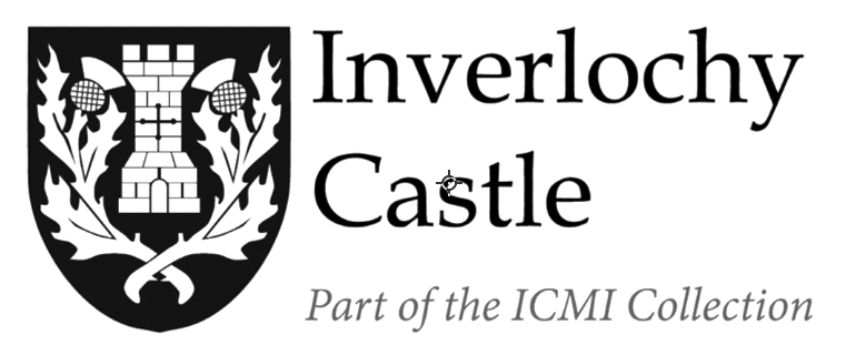
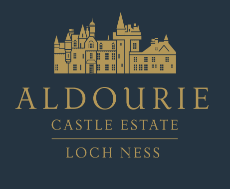
These two logos are for castles located in the UK that have been transformed into luxury hotels. Both succeed in referencing their past while maintaining a sophisticated and more current look.
The first logo chose to use a crest style logo with the shield shape and references to the castle. However instead of using detailed drawings the logo uses blocky graphics more commonly seen in logos today.
The second logo looks even more modern with the color and shape they used. However, whereas the previous logo used simplified graphics this logo took the very details that make up the castle itself. Because these castles are already landmarks with a rich history it’s common for people in the U.K. to recognize them at a glance. This logo uses that fact to its advantage by recreating the castle (in a modern style) so the location is instantly recognizable.
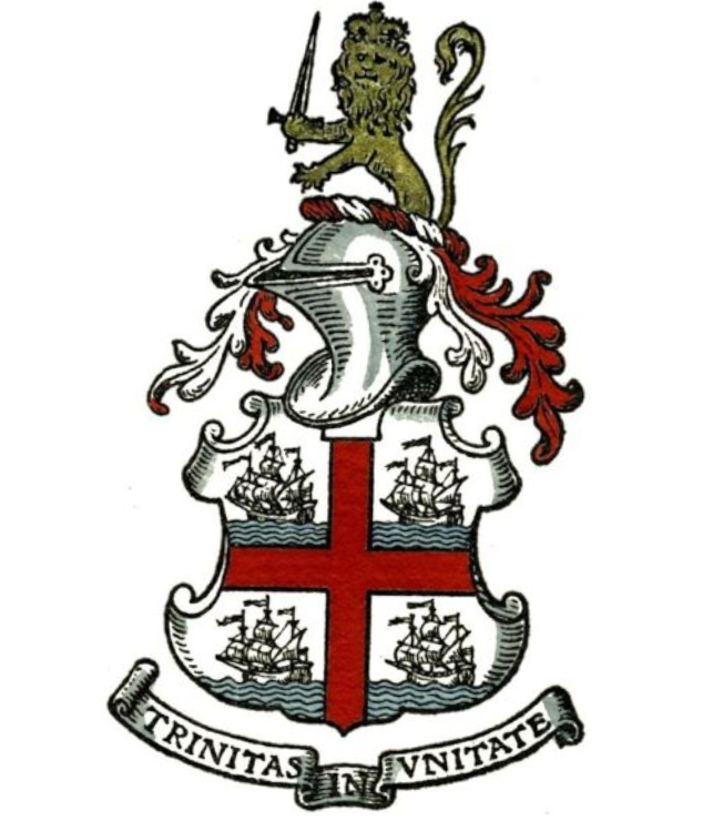
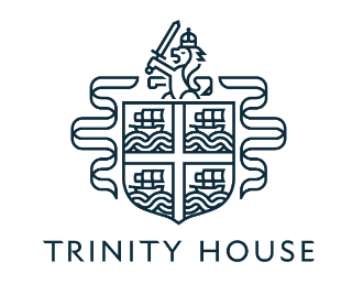
Another great example of balancing past and present in a logo is Trinity House. This private company has been around since 1514 and provides maritime training and assistance to British seamen. Today it is commonly called Trinity house but considering that its full historic name is ‘The Master, Wardens, and Assistants of the Guild Fraternity or Brotherhood of the most glorious and undivided Trinity and St. Clement in the Parish of Deptford Strond’ it’s very clear frequent brand updates are necessary. Their current logo is based on the original crest shown below. As beautiful as the original design may be it does not reflect the company’s current relevance or advances in technology. The new logo pays homage to the original by showing the 4 ships, the crowned lion, and the red cross traditionally put on house crests. The new logo paired down the etching design into a simpler line art style. They also changed the logo color palette to one simple color.
Designing new logos for old companies can be a challenge but it is a great way for a business to honor it’s past and highlight what makes them special. If you’re looking to create a logo design that is both modern and vintage take some inspiration from the examples above or call BRANDING IS WHAT WE DO in Denver, Colorado for a design consultation.


