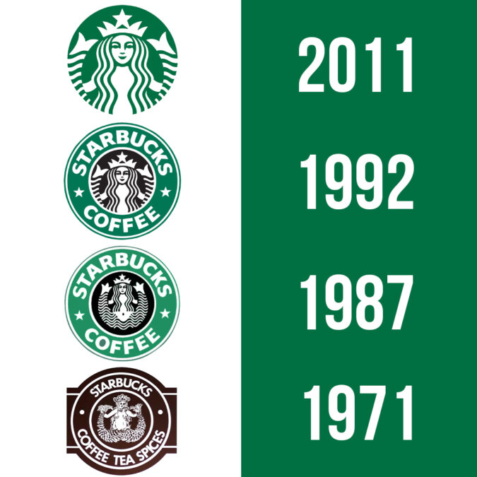

The Starbucks logo has gone through many iterations, each time becoming simpler and simpler. Why did Starbucks go through all these different rebrands? And what can we learn from it?
Starbuck’s rebranding strategies have been essential as the company grew and their customer base changed.
Below you can see each logo change came with a different era and reflects the necessary rebrand that came with it.
By understanding their rebranding changes, we can better understand the importance of keeping up with your changing customer base and how rebranding helps businesses adapt and grow.
1971 – First Logo Design
The company started in the ’70s and this is its first logo. It was made in a time when the identity of coffee was changing, from a cheap caffeine hit to an experience worth spending money on. The original owners showed this through the logo and the name. Starbucks, Coffee, Tea,and Spices makes their coffee product seem special and the siren graphic design gives the business a feeling of merchants bringing exotic treats to port. The logo also reflects Seattle, where the company started and where it’s first customers were.
The logo worked for the business because they needed to convince people that their coffee was special and worth the extra cost. It also played to the mariner theme Seattle, where it’s customer base was located.
1987
The company changed ownership in the ’80s, they also incorporated espresso for the first time. In the ’80s the American work culture changed. People were spending more hours at their jobs and women were becoming a significant part of the workforce. The long hours and competitive culture led to economic booms but also a bigger need for caffeine. Buying espresso drinks became the norm for working Americans. Starbucks capitalized on this by offering the product that the modern workforce wanted.
They also simplified their logo to reflect its consumers. The name was changed to simply Starbucks Coffee and the detailed print was made into a simplified graphic. These design changes showed Starbucks becoming a part of corporate America along with the rest of the country.
1992 – Logo Design Change to More Minimalistic Style
The 90’s logo is the beginning of the Siren becoming more conservative. The aesthetic became more minimalist and the siren featured only the face and tail(s), cutting out the navel. At this same time, tarbucks was branching out into the internal markets, opening its first store in Tokyo in 1996. This new minimalist logo could appeal to the company’s enormous customer base, branching out further than just the United States.
2011 – Starbucks’ Latest Logo Design Change
In 2011 the Starbucks rebranding was focused on one thing, being “good”. The company recognized itself as a powerful global brand and in a time where consumers are more aware than ever of a company’s influence in the world, Starbucks wanted to shine as a wholesome corporate identity. It focused its rebranding on global citizenship and responsibility. They’ve also focused on creating a pleasant customer experience with changes to their graphic design and the interior design of their stores. The logo design was purposefully simplified even more to the siren only. Emphasis was given to her flowing hair and smiling face, adding to the wholesomeness. The brand has successfully created a company that consumers feel “good” about.
Throughout its history, Starbucks has created a series of successful rebrands. They’ve focused on updating their looks and services based on their ever-changing clientele. They’ve also recognized that as their company grows and evolves its perception and brand identity needs to evolve too.
Learn from Starbuck’s rebrands. Never assume that your customers will stay the same or will always want your company to stay the same.


