Trending in graphic design, branding, and packaging design is Minimalism, Maximalism, and Nostalgia. The essence of all three boils down to how are you utilize the “Bells and Whistles” of graphic design: Use Less, Use More, or Use Antiques.
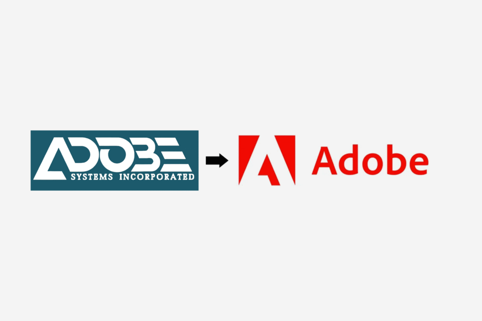
Minimalism means stripping away the excess from your designs (fewer bells and whistles). This can be effective because your image and message can catch the consumers eye more quickly. It’s an opportunity to boil down the visuals to the essence of what the brand is. Many consider Minimalism to mean void of colour but this is not true, it simply means using colour with more intention. With select colours, you can make packaging pop off the shelves. Too much, and your product might camouflage with all the other products on the shelf. If Minimalism is the route you choose, think long and hard about what words, images, and colour best express your brand. Keep this list extremely short, use less.
Alternatively, there is Maximalism. (Use all the bells and whistles!) This trend allows the graphic designer to be more of an illustrator or storyteller for the brand. The point is to use extravagance and excess to make the branding more memorable. Maximalism could be taken as an opportunity to illustrate (literally) the story or your business, or how you source your products. You could write about every detail of your brand and use unique Typography to make your words into graphics. This trend is about adding more but make sure it’s still attractive visually. Think about how you want to make this trend work for you, do you want it to feel luxurious? Or like pop art? Find your inspiration.
And finally Nostalgia, (Use old bells and whistles). In this a digital world, many people are drawn to an antique look. Giving something nostalgic graphic design evokes a feeling of comfort for the viewer. There are so many possibilities for using Nostalgia in your design but it needs to connect to your specific audience. If your product or business is geared towards gamers in their 30’s and you want to create a feeling of nostalgia it doesn’t make sense to use Art Deco typography and graphics. The gamers would more likely enjoy graphic references to their old Mortal Kombat Games whereas the Art Deco style might be more suited to a cocktail bar with an antique aesthetic. When brainstorming Nostalgic Graphic Design keep your audience at the forefront of your mind.
Graphic Design | Denver, Colorado
BRANDING IS WHAT WE DO™ is your best choice for high quality graphic design in Denver, Colorado. We are not a marketing firm, so we only focus on graphic design and printing for all of your branding needs. Our services include Logo Design, Corporate Identity & Presentations, Brochure Design, Business Cards, Marketing Material Creative Design, Large Format, Packaging Design, and more. Click here for a custom graphic design quote.


