Wordmark logo designs are a great fit for many brands in all industries. As defined in the infamous Wikipedia, a wordmark logo design is “usually a distinct text-only typographic treatment of the name of a company, institution, or product name used for purposes of identification and branding” – but what does that mean? Have you seen the Coca-Cola or Google logo? Have you noticed that neither logo design have a symbol or mark to help you remember their brand? Instead, these wordmark logo designs use color and a very distinct or unique font style in their branding.
This is very different from logo designs like Nike or McDonalds, which use a symbol to help you remember their mark.
Which logo design style is better?
There is really no right or wrong answer here. A brand is built by how you make people feel about (perceive) your brand, not just your logo design. Your brand can use voice, style, packaging, video and so much more to achieve its unique market position. That being said, your logo design is still very important and its design is crucial in your branding efforts.
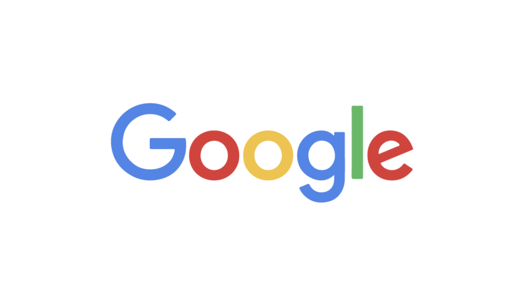
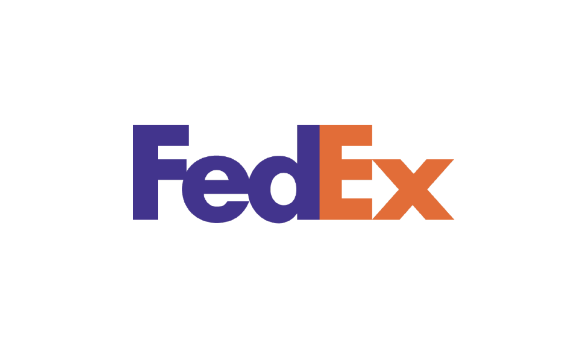
Below are some very recognizable wordmark logo designs that you may be very familiar with:
Looking for Logo Design and Creative Graphic Design?
We are Denver’s best choice for logo design and graphic design services. We make our logo design offering easy and we take the time to listen to your brand goals and visions and learn about your target audience and industry. We create several concepts for your review and approval with 100% satisfaction guaranteed. Click here to get a quote.


